THESIS PROJECT
No Strings, a handcrafted wooden art toy brand designed to redefine how toys are experienced and collected. Rooted in sustainability, artistry, and pop-inspired storytelling, the thesis demonstrates how design can solve a client’s challenge, elevating a simple product into a memorable brand identity that balances nostalgia with originality and craft with modern market relevance.
The Problem
The challenge addressed in this thesis was to reposition a small Wisconsin-based wooden toy company for entry into the global collectible art toy market. Traditional toys were often perceived strictly as children’s products, limiting their cultural prestige. The goal was twofold: to elevate wooden toys into art collector pieces through design storytelling and to create differentiation in a market dominated by plastic and resin figures. The process required moving beyond surface aesthetics to show how iterative design decisions could transform toys into objects of cultural and emotional value.
The Solution:
Brand Development
Onlyness Statement
No Strings distinguished itself as the only art toy brand producing entirely from natural wood, using sustainable, handcrafted methods. This claim was not simply a marketing phrase but an anchor point for design decisions across assets. For example, discarded early versions of the identity leaned too heavily on modern, glossy finishes that risked obscuring the wood’s authenticity. By returning to raw materials, textures, and woodgrain as the foundation of the identity, the brand re-centered on its artisanal core. The Environmental Protection Agency (2023) reports that 78% of U.S. consumers consider sustainability important when making purchases, showing that this pivot also aligned with audience demand.
Voice & Tone
The voice of No Strings was refined through several iterations, beginning with overly whimsical drafts that lacked edge and later moving into a darker, rebellious tone that risked alienating family-oriented collectors. The final balance struck was rebellious but approachable, pairing wit with sophistication. This tone helped the brand signal high design values while still welcoming younger audiences into the collectible space. The National Endowment for the Arts (2022) notes that narrative-driven voices increase engagement, and here that insight was applied to ensure storytelling worked across packaging, advertising, and campaign messaging, not just isolated copywriting.
Look & Feel
The look and feel evolved through multiple refinements. Early palettes leaned too muted, creating visual softness that contradicted the energy of collectible art toys. After critique and self-assessment, circus-inspired CMYK tones were added over natural wood hues to inject vibrancy. The Smithsonian Institution (2020) highlights that bright primary palettes trigger joy and recognition in nostalgic contexts, which validated the decision to increase chromatic contrast. Shape exploration also went through rounds: exaggerated puppet silhouettes were initially too literal, and later versions stripped them back into abstract curves, strings, and gestures. Textures of bark and grain remained consistent throughout, anchoring the visual identity in authenticity.
Vision Board
The vision board was not finalized in one draft but evolved from heavy pop-culture borrowing into a more nuanced balance of cultural motifs and original imagery. Early iterations relied on Disney-inspired references that blurred originality. Feedback prompted the inclusion of broader archetypes, sock puppets, wooden joints, skeletal motifs, juxtaposed with pop-art symbols like paint drips. The Library of Congress (2021) notes that puppetry historically functions as both entertainment and social commentary. This helped refine the board into a tool for balancing nostalgia with originality, using cultural memory as inspiration rather than replication.
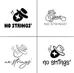
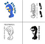
Logo Development
Logo development followed an iterative cycle of sketches, critiques, and refinements. Initial sketches were too derivative of Pinocchio and were discarded for being overly tied to copyrighted imagery. Subsequent explorations of whales, crickets, and stringless puppets built a stronger metaphorical base. Critiques revealed that some versions were too detailed to scale effectively, leading to simplification into bold, minimal forms. The Puppeteers of America (2021) emphasize that puppetry thrives on exaggerated, simplified forms that communicate emotion, this insight was applied directly to refine the logo into a recognizable, expressive emblem. The final design balanced whimsy with minimalism, achieving both originality and cultural resonance.
Brand Media Assets
The media assets were developed iteratively, not as one-off polished outcomes. The animated logo, for instance, began as a static mark with minimal motion and evolved into a sequence that highlighted rebellion by visually “cutting” the strings. Social media templates were first too text-heavy, later simplified with bold imagery for clarity. Billboards went through several drafts adjusting type scale until legibility was achieved at distance. The National Endowment for the Arts (2022) stresses the importance of consistent integration across digital and physical platforms. This principle guided every refinement, ensuring cohesion between merchandise, playbook layouts, packaging, and large-format applications.


Evidence of Success
The No Strings identity answered the original challenge by demonstrating how handcrafted wooden toys could be re-framed as cultural collectibles. Leveraging nostalgia, sustainability, and narrative design elevated the toys beyond child-oriented products. The Federal Trade Commission (2022) reports growing consumer preference for transparent and authentic brands, particularly those tied to sustainable practices. By tying each refinement, palette adjustments, logo simplification, voice recalibration, back to authenticity and narrative weight, No Strings positioned itself as both competitive in the global art toy market and true to its artisanal roots.
References
-
Environmental Protection Agency. (2023). Advancing sustainable consumption and production. https://www.epa.gov
-
Federal Trade Commission. (2022). Consumer trends and brand transparency report. https://www.ftc.gov
-
Library of Congress. (2021). The cultural history of puppetry. https://www.loc.gov
-
National Endowment for the Arts. (2022). Art and storytelling in community engagement. https://www.arts.gov
-
Puppeteers of America. (2021). The expressive traditions of puppetry. https://www.puppeteers.org
-
Smithsonian Institution. (2020). The psychology of color in art and design. https://www.si.edu
